This long range plot shows the net difference of people’s coming and going (added and archived). This will help you see broader trends.
If you have already registered for GHC simply open the add on above:
Look for growth patterns over years and months. You can also click on years to look at particular month patterns for that year.
Advanced feature:
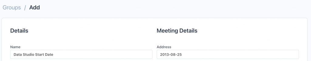
You’ll notice in the plot above that the first year of data (2013) has a large peak. This is because hundreds of people were imported in bulk from a previous system. To set a start date after that initial import you can specify a date to start analysis by creating a group called “Data Studio Start Date” and put a specific date in the address field (must be yyyy-mm-dd format). Set this date to a day or a month after the initial import and you’ll see a trend of growth or otherwise around the zero centreline.